
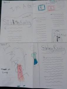
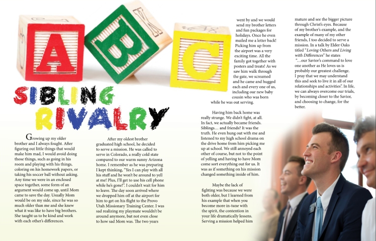
My first part of this project was to draw a sketch of how I wanted my spread to look. Then in Adobe Indesign we were instructed to create a shape map, where we make our layout digitally and use filler text and blank images to get our ideas on screen. Then we finally made the first rough draft of our project and I used my images and story. I chose a crayon font for the title to incorporate the story of two young siblings. In Adobe Photoshop I edited the photo of the brother to give it a transparent look so the text would have the same background as the rest of the layout. I used a primary color scheme.
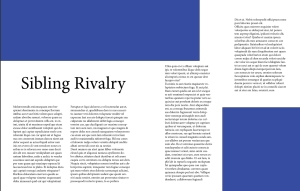
Here’s the final product of my design after getting critiques and editing some things in my rough draft!
Critique: In our class facebook group Payton suggested on Thursday that I make my background a creme color rather than plain white. Then Cody Zeitler suggested over facebook messenger that I make my photo blend into the background rather than have a harsh line where the photo ends. So I went into photoshop and edited it with the eraser tool to take out some of the background and make the edges clear. I also increased my font size a little to make it more readable. I added the drop cap on the first letter in my project as well for the start of the paragraph.
Fonts: Fun Crayon script, Minion Pro serrif
Links to Images: https://www.lds.org/media-library/images/romania-classrooms-praying-teaching-learning-1407592?lang=eng
